A quick note for context: This page is adapted from a Professional Development Workshop run by Dr Kelsey Perrykkad in 2019 for Philosophy Graduate Research Students at Monash University. It will be most relevant for researchers outside the sciences who have been asked to give poster presentations at a conference, but the principles also apply to scientists who want to break the mould of their institution’s poster templates.
Introduction
You’ve been asked to give a poster.
“But, I’m a philosopher!” you protest, “I don’t have fancy graphs and ‘results’. Surely the conference got it wrong when they allocated my paper to a poster!”
It’s true – if you google search ‘how to make an academic poster’ or even look at tutorial papers about how to make good academic posters (e.g. Gundogan et al, Annals of Medicine and Surgery, 2016) you get advice and templates that assume a typical scientific structure – introduction, methods, results, conclusion, references etc.
An academic philosophy poster thus takes a bit more thought and creativity in how you present your research. But this doesn’t mean it’s less worthwhile, and academic posters/effective visualisations of philosophical arguments can make your research much more accessible to a wide (interdisciplinary) audience.
What is an Academic Poster?
Posters are a presentation type which allows for small group/1:1 conversations around a research project. Presenters are expected to stand with their posters for the duration of the poster session, and deliver short elevator pitches of their poster to passersby who peruse the posters at their leisure – some attendees will do this in a targeted way, seeking out particular content, and other audience members tend to wander and see what takes their interest.
What is a poster good for? What are some markers of a successful poster?
Posters allow for both broader audience participation (can you capture the attention of someone who wouldn’t have attended a talk stream you present in?) and also the opportunity for more personalised and deep conversations depending on the interests of the people who end up talking over a poster. Audience members can get very quick overviews of research, but also really delve into the research of most interest and relevance to them, and opportunity to pick the brain of the researcher, and express confusion without the public exposure in a talk question time.
Converting an idea into a simpler, visual form can:
- help clarify the structure of the argument and the connections between sections of a paper draft
- enable communication to a broader audience
- Time: interested parties at the conference who may otherwise not take the time
- Access: audience members from neighbouring fields who may not usually browse your field
- = possible new collaborations or expansion of the field
- serve an advertising role for an upcoming project
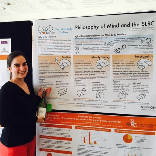
Plus, sometimes a good poster can win you a bottle of wine!
Other Resources:
Better Posters Blog Consider the “Morrison Billboard“, which emphasises the take home message for clear communication (relevant “better posters blog” critique).
Tip 1: Know your Audience
This is important for anyone making a poster, but is especially important in interdisciplinary spaces.
• What is appropriate assumed knowledge?
• Will intuitions match?
• What level of detail are they likely to care about?
• How can you engage their interest?
Tip 2: Consider Practical Considerations and Relevant Design Principles
Everyone can make a good looking poster, you don’t have to be a skilled artist or graphic designer. You don’t have to be good at fancy programs (though it can help you get what’s in your head on the page). Here are some things to consider when approaching poster design:
- Programs: Programs like Adobe InDesign are purpose built for this kind of task, and allow for fine grained manipulation of text and layout and automatically size up well for print (for the graphics nerds: because they are vector based). However, they involve a bigger learning curve. Microsoft Powerpoint is often used to make academic posters, and despite text sizes and layout sometimes doing unexpected things, it is ubiquitous and has a smaller learning curve due to its’ common use and shared features with e.g. Microsoft Word. Online tutorials exist for how to set up a powerpoint slide with the correct dimensions and resolution to facilitate printing clarity – do this before you start (e.g. microsoft tutorial on changing slide dimensions – including for printable ratios).
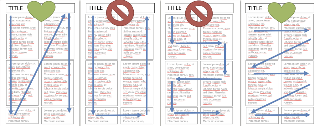
- Layout: Try planning a layout on paper before you start. Most importantly, embrace blank space, and make sure your layout gives some space for the eyes to rest. Once you move to the digital space, rely heavily on the alignment tools so that your design is visually neat. Think and plan in boxes, but avoid including boxes, as the content can feel strangled. Consider your elements in columns or rows, and don’t change the visual flow/order part way through the poster – how to read the poster should be obvious without the presenter’s help. Here is the same amount of content with four different flows: notice how the ‘natural ways’ to read the boxes is either the first (columns) or the last (rows) options. The options in the middle would not be good ways to lay out your content:
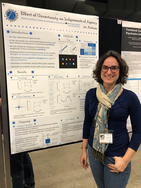
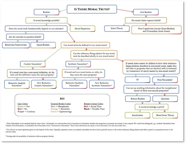
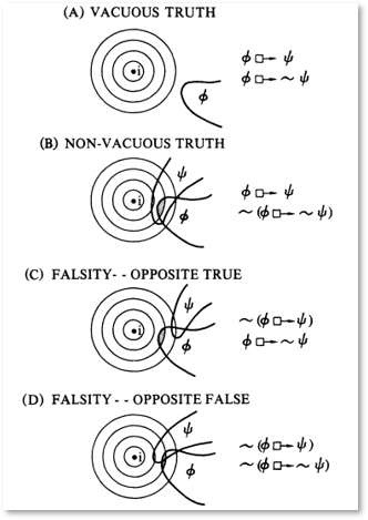
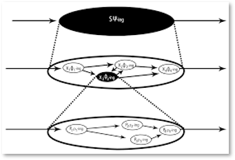
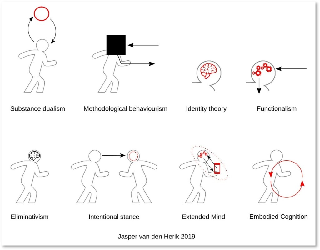
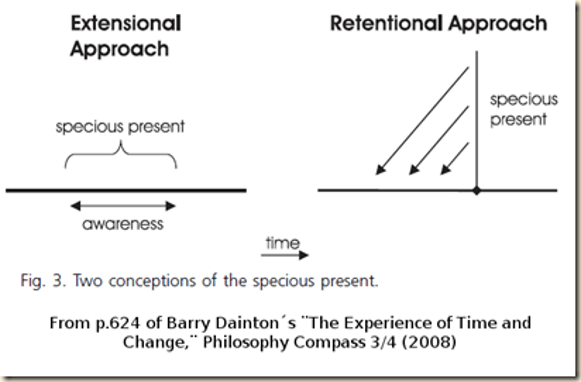
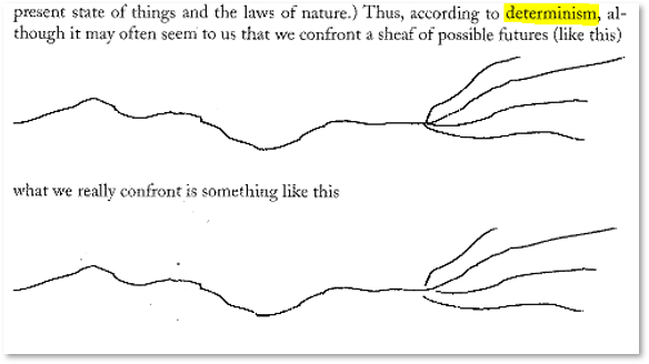
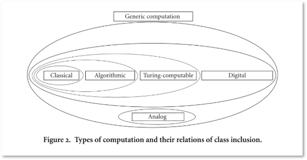
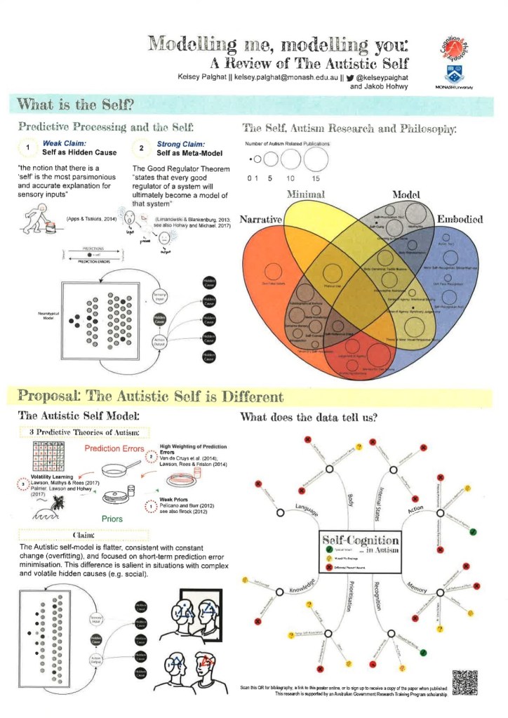
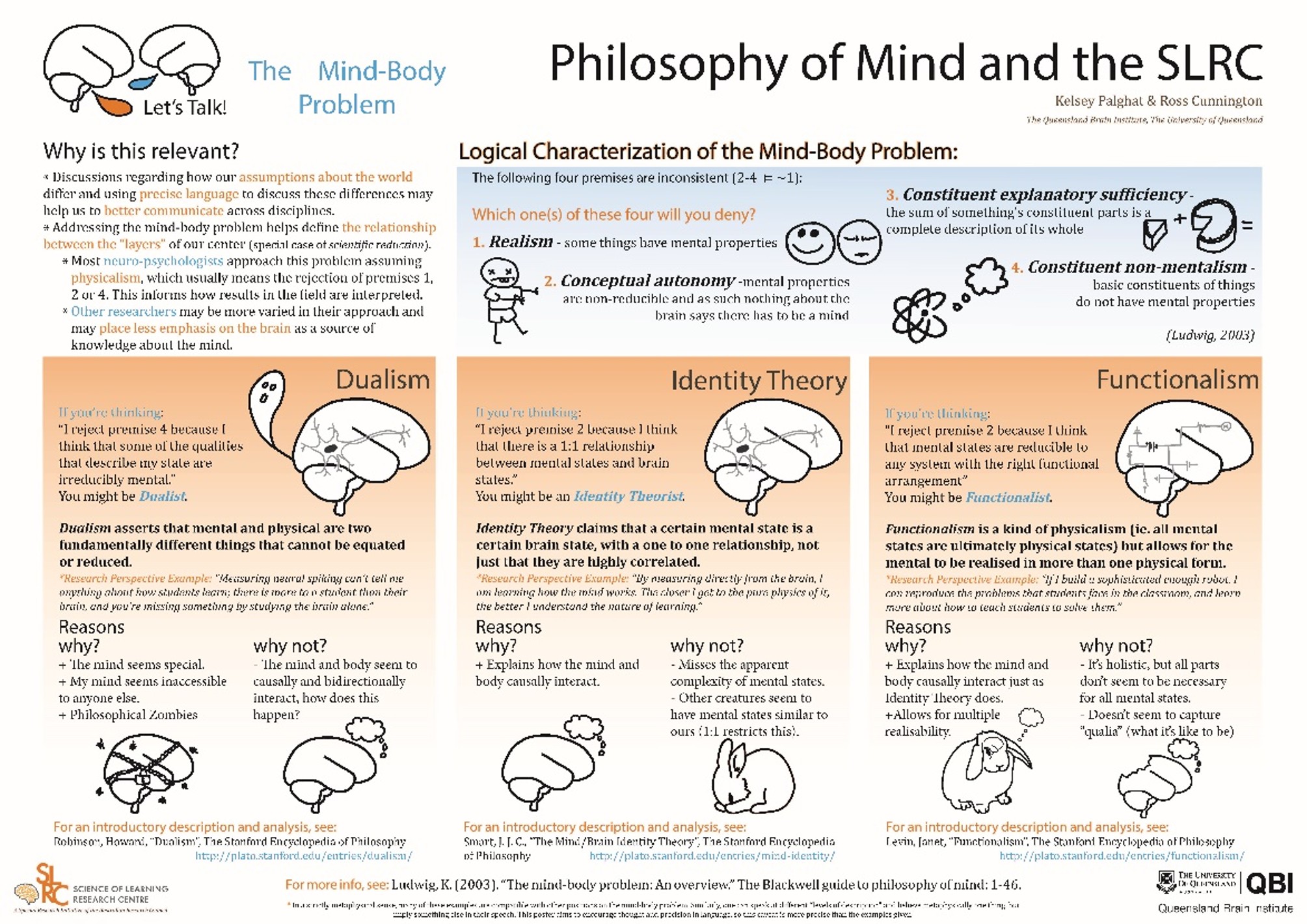
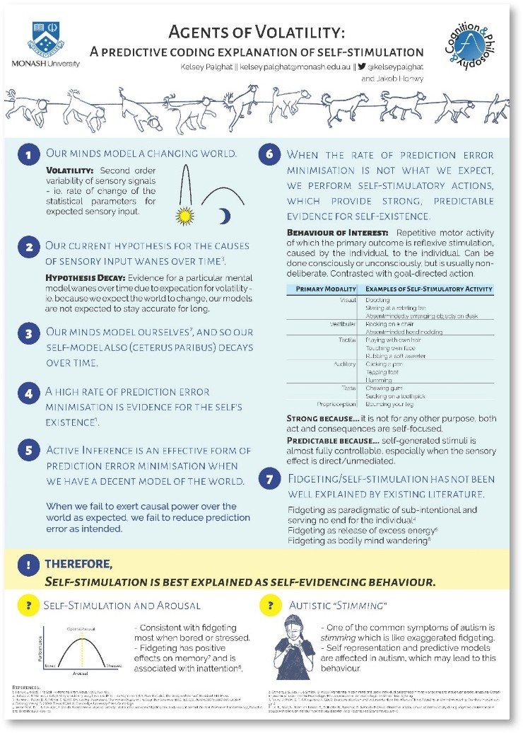
- Images: An image is worth a thousand words, and an effective schematic or figure can be very effective, even with philosophical content. Ideally, images should communicate something, not just be an aesthetic choice. If you can’t communicate anything through images, at least have relevant ones to catch attention and rest the eyes. Challenge yourself! Try diagrammatical communication. Here are some examples of images from philosophy papers, collected via a twitter callout (in 2019, a simpler twitter time…):
A technical note on image formats: some image formats scale up (e.g. to large poster size) without issue, because the data is stored as points and lines (vector formats e.g. .svg .ai .pdf .eps) rather than as pixels (raster formats e.g. .jpg .gif .png .tif .bmp). If you choose a raster based format, make sure it is of a high, printable resolution (e.g. 300dpi, the higher the better).
- Colour: Choose a few colours for a visually appealing poster – consider using a predefined colour palette, such as coolors.co. Assign colours to purposes (headings, accent/emphasis, background, text). Think about accessibility, including visual contrast in tones and colourblindness. There are colourblind simulator websites, but one simple and effective strategy for many colour related accessibility checks is to print your poster in black and white and check for legibility of images and texts.
- Fonts: Use really really big fonts. Bigger than you think is necessary. Aim for the smallest intended-legible text to print larger than 2.5cm in letter height. Aim for four or fewer font sizes, and be consistent (e.g. title > subheadings > main text > references). In terms of what fonts to use, the best printed legibility is serif fonts (e.g. times new roman), digital legibility is best with sans-serif fonts (e.g. arial), and script fonts are often the most difficult to read. Google fonts has great free fonts. Aim to use 2-3 fonts max, and be consistent with where they are used for visual clarity.
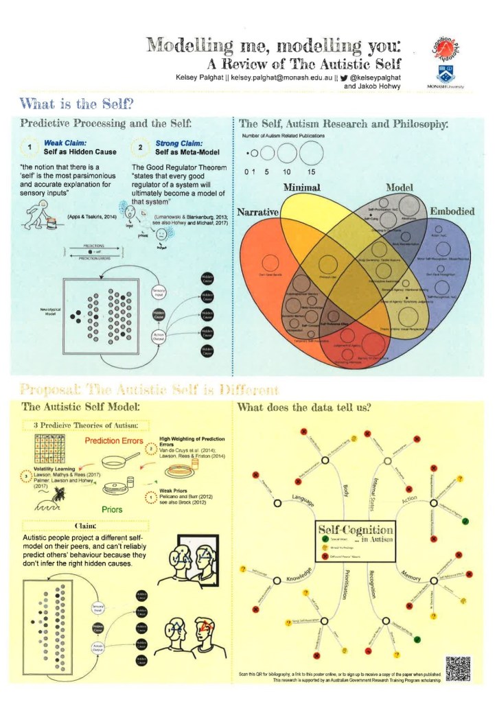
- Proofreading: Print your poster on an A4 sheet to proofread, and consider also printing it in black and white as well as colour to check accessibility. A4 has the same proportions as A0 which is the most common poster size recommended by conferences. A poster printed at A4 should be easily legible and clear and simulates looking at your poster from a middle distance on the day. You can see an example of my process of refining a poster by printing it through the following scans of an early version of Modelling Me, Modelling You (2020) paper presented at a conference in 2017.


- Printing: Don’t leave it to the last minute – printing at a large size can take time. Consider costs which can be very variable. Decide whether you plan to travel with your poster (e.g. in a mailing tube) or whether you plan to print locally, and plan accordingly. Your university may have the ability to print at A0, or you can go somewhere like Officeworks.
Tip 3: Do NOT copy and paste bits of your paper
Try to include as much text as you would in an abstract (but the less the better)
You can always link to a full paper, blog post, copy of the poster, sign up to receive a copy of the published version, print handouts, print copies etc… (good to include advertising)
You should be able to read the poster, without squinting, if printed on a normal A4 sheet of paper. Or read it easily when it is in full view on a small laptop screen.
Overwhelming the viewer with text will not accomplish the goals of an effective poster.
Exemplars:


This page is adapted from a Professional Development Workshop run by Dr Kelsey Perrykkad in 2019 for Philosophy Graduate Research Students at Monash University.
